Accompani

Visual identity, illustration, and packaging for a line of Amari inspired by the process of mixing cocktails.
-
Accompani is a line of Liquers, Amari, and Vermouth that celebrates the shared experience of creating and drinking cocktails.
In the past, Amari have felt exclusive with barriers to entry for novice cocktail connoisseurs. Our friends at Straightaway came to us with the vision to make Amari approachable, accessible, educational, and fun.
We created every element — from branding, illustration, and packaging to copywriting and product naming — pulling inspiration from the ingredients and process of mixing cocktails.
-
Client: Straightaway
Studio: OMFGCO
Role: Lead Designer & Art Direction
Creative Director: Jordan Metcalf
OMFGCO Team: Orion Janeczek, Fritz Mesenbrink, Brandon Bidleman
Photography: Remy Gomez
-
Naming, Brand Concept, Brand Strategy, Visual Identity, Copywriting, Illustration, Packaging

The wordmark strikes a balance between history and modernity — establishing trust and high quality, while evoking play through its fluid sharp and soft characteristics.
The brand icon serves as a reminder that Accompani products are a companion for drinks and a drink for companions.

Accompani's visual world is made up of fluid patterns, structured typographic layouts, vibrant colors, a robust illustration system, and a dynamic die-cut packaging system that communicates the nuance and flavor profile of each product.
We selected Reckless Neue for its elevated x-height and calligraphic influences, and GT America for its robust range of weights and widths.

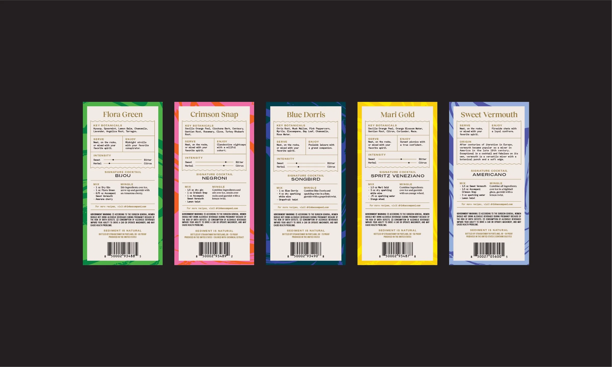
We designed the label system with the intention to be highly transparent and educational — informing the drinker how each Amari should be consumed, taste, and make them feel.
Beginning with a simple zig-zag line, each label shape is customized with sharp or soft edges to communicate the flavor and finish of each product — ranging from sweet to bitter and herbal to citrus.


We personified each product as if they were a close friend — with their own personality, unique name, and expressive look — informing our design and copy decisions every step of the way.
The back labels balance playful and educational information — all in an effort to help drinkers gain a deeper understanding of each product.