
wayhi
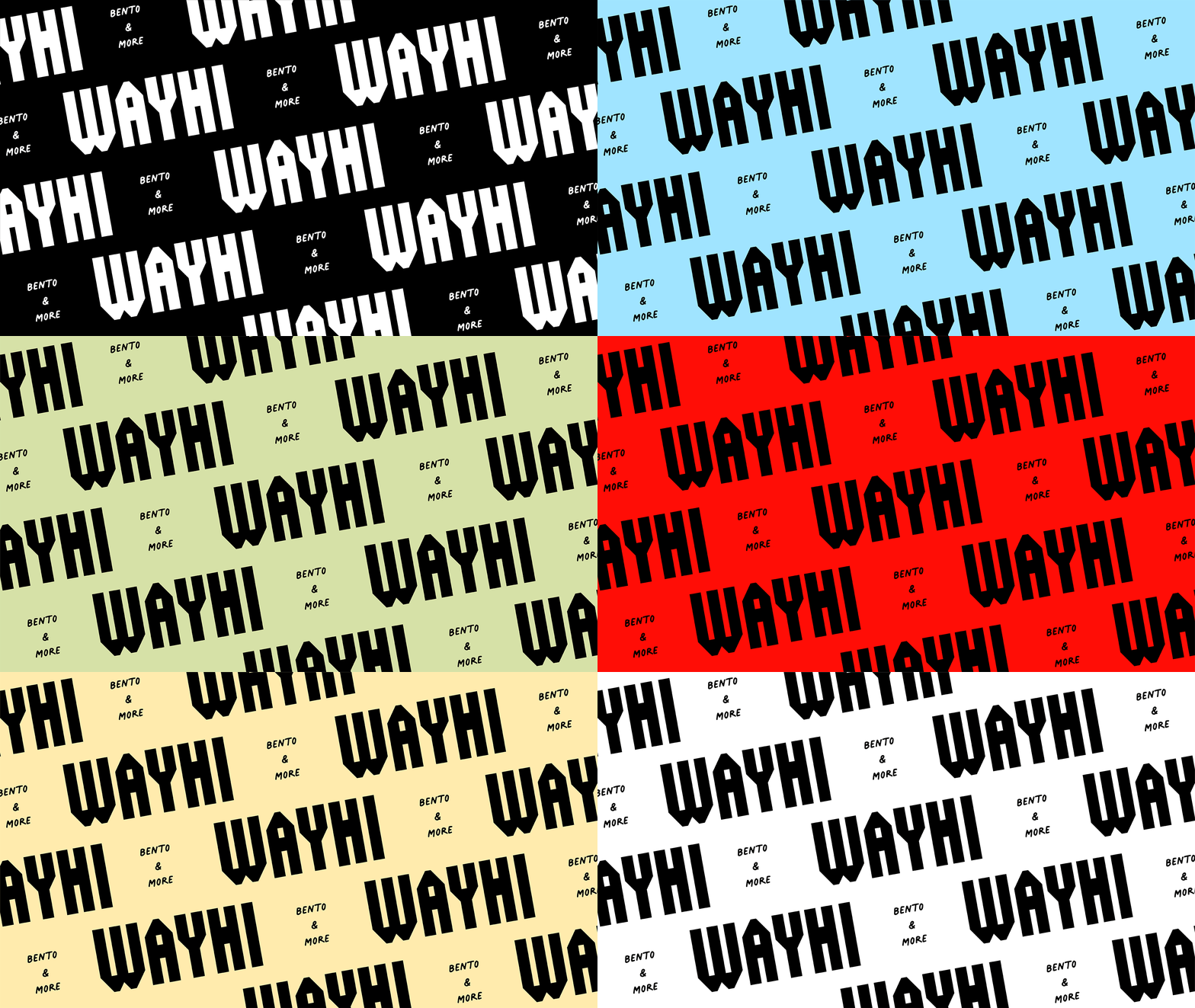
Visual identity for a no-nonsense food cart serving up bento & more in portland, oregon .
-
Will Clark, a professional skier turned food cart owner, came to me with the goal to create a brand inspired by streetwear, ski and surf culture, and the simple goodness of bento.
Just like bento — a convenient meal made of rice, meat, and vegetables — the brand is composed of simple ingredients and the magic lies in the visual sauce. Bold typography pairings, a playful illustration suite, and a classic color palette work together to create a brand full of personality, grit, and energy.
-
Client: William Clarke & Katherine Garber
-
Brand Concept, Visual Identity, Illustration, Packaging, Signage

The name “Wayhi” is derived from the act of skiing — being way up high in the mountains. The logo suite is flexible — composed of bold, geometric letterforms that can be solid, shadowed, and fit within a form representative of the mountains — to function like a streetwear brand that can take on different tones in different applications.
At Wayhi, the sauce is 100% boss — it’s how customers can add their personal spin on the classic dishes offered. With an ever-growing library of homemade sauces, the label system is designed to be easy to update and maintain over time. Handwritten type pairs with the chunky letterforms to create a casual, yet impactful contrast.

The cart’s mascot — named “Saucy Boy” as a homage to the array of sauces offered — appears throughout the Wayhi brand participating in the numerous recreational activities present in the Pacific Northwest that owner Will and his friends love to do.
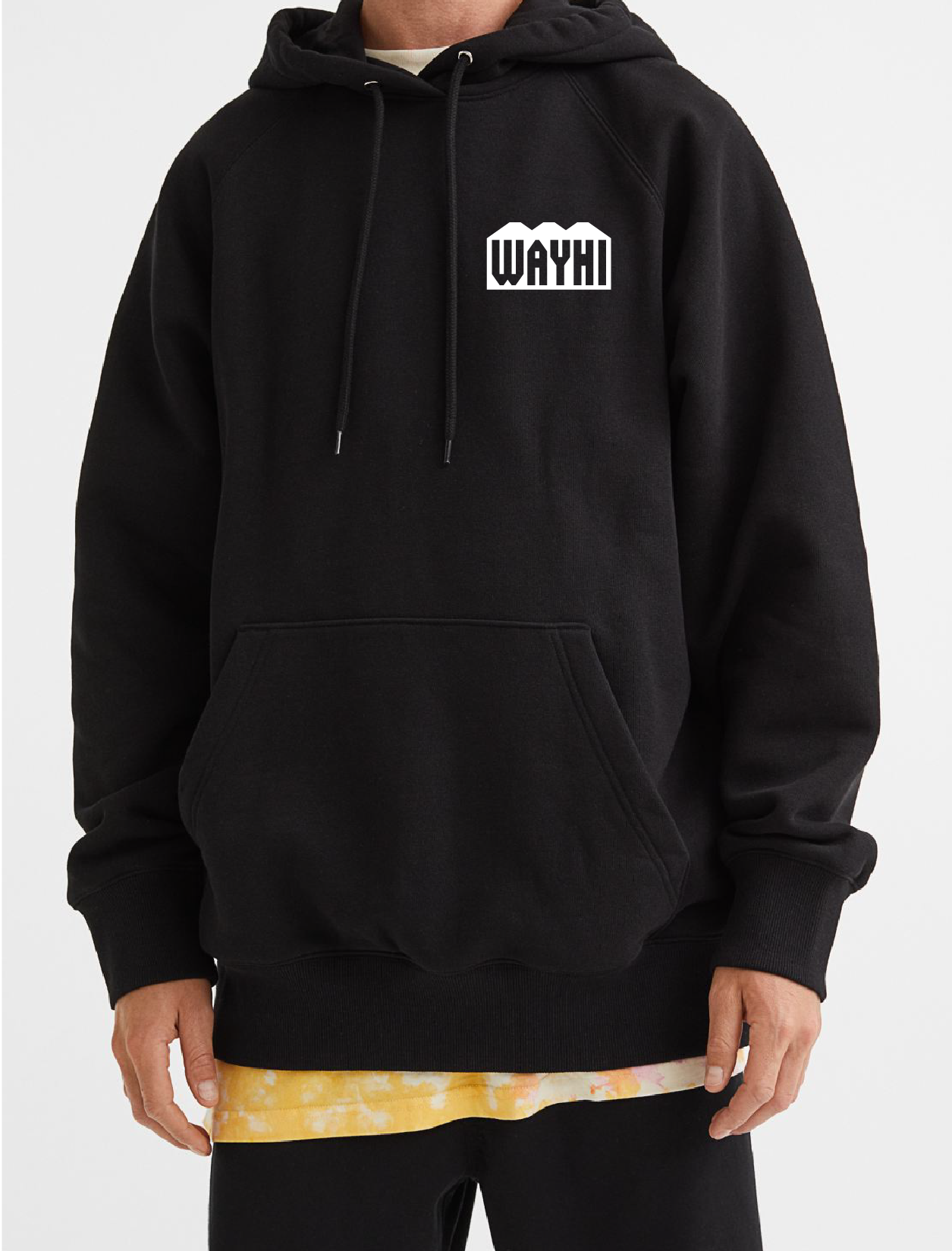
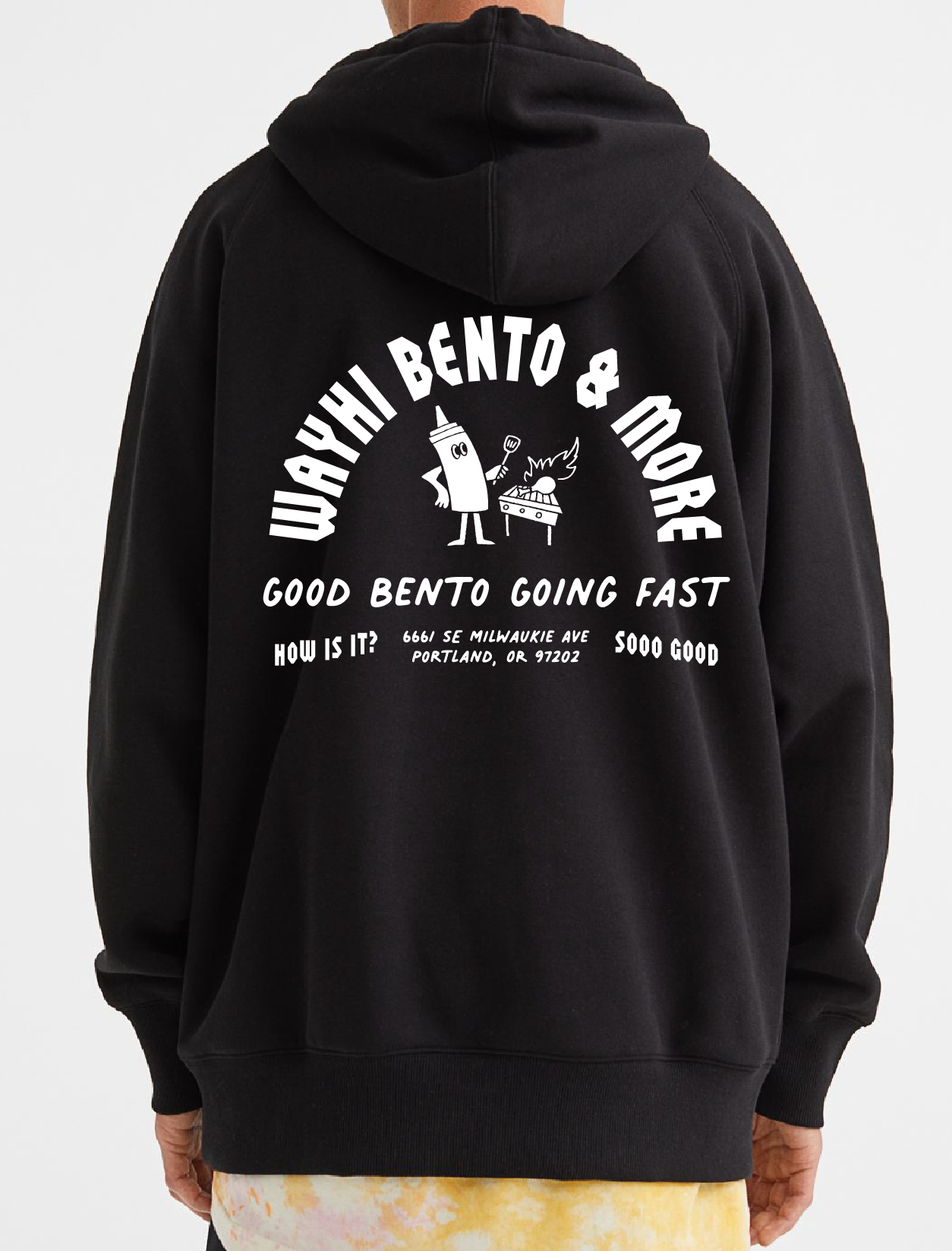
A simple black sweatshirt serves as the perfect uniform for cart workers, outdoor recreationalists, and bento connoisseurs.
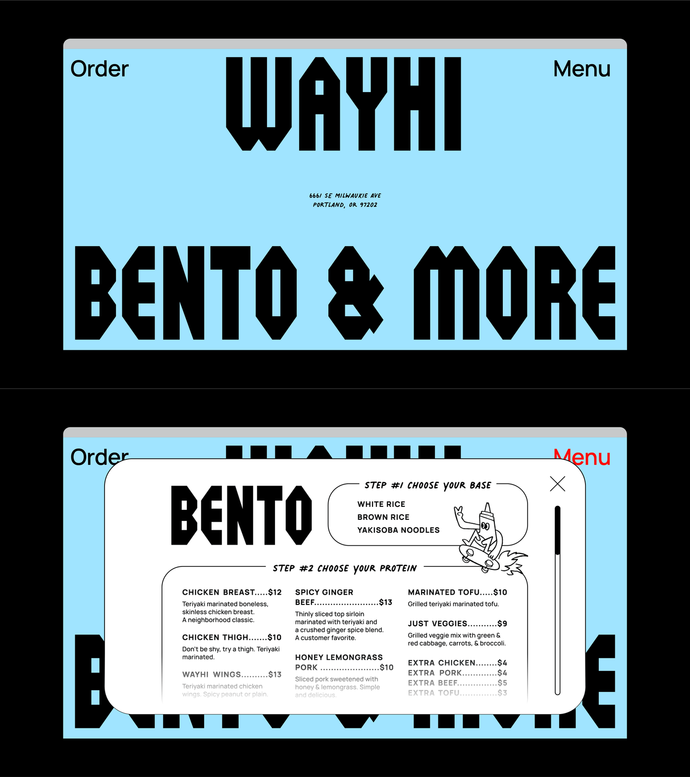
The website, menu, and cart graphics are designed to be minimal, yet memorable, and provide a clear sense of hierarchy mixed with moments of delight.


